Thursday, June 28, 2012

Thursday Thrill

Hey All!!

Welcome back!!

I have a couple of card shares for you on today's 
Thursday Thrill

I wanted to feature 
One Stamp Two Ways


For the first card I tried for more of deeper hues and chose to use colors
Pacific Point #111350, Tempting Turquoise #102067, Daffodil Delight #119683 and Whisper White #100730. 


The stamp set used is Fresh Vintage Stamps Set (w:125115  c:125117).
 I colored the floral set using Stampin Up markers in colors Daffodil Delight, 
Garden Green, and Tempting Turquoise onto a clean sheet of Whisper White.
Then using my 1 1/4" Square Punch (#119865) 
I selected what portions of the images I wanted to use for my card. 


The colors came out so vibrant and crisp 
you'd never think it was colored by hand....
Sentiment is from the Word Play Set (w: 120308 c: 120651)


And the inside of the card I added a little feature too from extra
pieces I had of the square punches. 

NEXT.... 


The colors chosen here are Chocolate Chip #102128, Whisper White #124302 
and Calypso Coral** #122976 
** added plug this is one of the featured colors I have in my 
GIVEAWAY only offered this week**

The Designer Series Paper you see in the background is from 
Everyday Enchantment  #126154; we will also use this 
paper two different ways as well!


Here you see I used the same Fresh Vintage Stamps 
Set (w:125115  c:125117) in only Chocolate Chip #126979. 

I added a tear feature on the Whisper White for texture. 
And the sentiment shown is from the Friendly Phases Set (w: 126149 c: 126151)
but I only featured the portion of the sentiment I wanted
again using Stampin Up Markers.

Having the luxury of markers in the exact same 
color as my inks and paper helps to accentuate 
and coordinate just exactly what I need- No Hassel. 

Then I used the floral Calypso Coral pattern for the background of the card to
introduce the Color in Cardstock as well as in the  Everyday 
Enchantment  #126154 Designer Series Paper
but flipped the paper over (because its printed on both sides)
to use the stripes as a pop of 
new color to introduce to the project. 

Simple Clean and Cool!! 


Designer Series Paper: Everyday Enchantment  #126154
Cardstock:  Pacific Point #111350, Tempting Turquoise #102067, Daffodil Delight #119683, Chocolate Chip #102128, Whisper White #124302 and Calypso Coral #122976 . 
Ink: Chocolate Chip #126979
Stamp: Fresh Vintage Stamps Set (w:125115  c:125117), Word Play Set (w: 120308 c: 120651), and Friendly Phases Set (w: 126149 c: 126151)
Tools Used: 1 1/4" Square Punch (#119865), Curly Label Punch (#119851) and Decorative Label Punch (#120907)


***AND DONT FORGET***
ONLY 2 DAYS LEFT!!!
I'M OFFERING 20% OFF OF ALL 
NEW CATALOG PRODUCTS

VALID ONLY UNTIL SATURDAY JUNE 30, 2012
<<MINIMUM $25 PURCHASE>>
ANYTHING YOU WANT FROM OUR CATALOG FOR 20% OFF!
YOU HAVE TO EMAIL ME YOUR ORDER AT NIKKI.SAPIEN@YAHOO.COM 
WITH ALL YOUR CONTACT AND PAYMENT INFORMATION
OR 
IF YOU PLACE YOUR ORDER ON MY WEBSITE YOU WILL RECEIVE YOUR 
20% REBATE FROM ME ONCE PAYMENT HAS BEEN POSTED 
(USUALLY WITHIN 7-10 BUSINESS DAYS) 
PLUS....
THE FIRST THREE PEOPLE WHO PURCHASE
WILL RECEIVE A 6X6 SAMPLER PACK OF THE FEATURED 
2011-2013 IN COLOR CARDSTOCK AND 
2011-2013 DESIGNER SERIES PAPER!!!
THATS A $20.95 VALUE-FREE 
THESE COLORS ARE DREAMY AND CAN BE
A CORE ELEMENT TO ALL OF YOUR CRAFTING!!


Wednesday, June 27, 2012

Clean and Cool CAS Wednesday


Todays CAS (Clean and Simple) card is extra special!! Not only was this 
CAS quick and easy to create! 
3 minutes and DONE!

Today's highlight is to show how simple, clean and cool our 
2011-2013 In Colors are!! (Which are Still Available)

***PLUS A SPECIAL OFFER AT THE END OF THIS POST***


The In Colors I selected to use were Pool Party (#122924), Lucky Limeade (#122926), Wisteria Wonder (#122922) and Calypso Coral (#122925). 
I honestly cant remember exactly where the idea for this card came 
but I do believe I something similar shown on 
a really cool website SplitCoast Stampers


Plus I wanted to highlight Stampin Up's AWESOME Paper Piercing Tool (#126189) and Mat (#126199) are!!!  

I have used this tool for all my projects from assisting me in 
attaching brads to accenting (as seen)

I love how simple SU! makes Paper crafting so Simple! 
No more wasted time in 50 different tools and crunchers 
to achieve the look I want! My time is valuable!


Simply line up where you want your accent to be with your 
Piercing Mat and Pierce! 


SO AWESOME, ANYONE CAN DO IT !!!


Designer Series Paper: Designer Series Paper Stack #122384
Cardstock: Pool Party #122924, Lucky Limeade #122926, Wisteria Wonder #122922, Calypso Coral #122925 and Whisper White #124302. 
Ink: Pool Party #126982
Stamp: Curly Cute (w:117014 c: 120510)
Embellishments: In Color Printed Brads #122940 and Island Indigo 3/8" Ruffled Ribbon #122974
Tools Used: Paper Piercing Tool (#126189) and Mat (#126199)


***TODAY'S EXTRA SPECIAL TREAT***
3 DAYS ONLY!!!
I'M OFFERING 20% OFF OF ALL 
NEW CATALOG PRODUCTS

VALID ONLY UNTIL SATURDAY JUNE 30, 2012
<<MINIMUM $25 PURCHASE>>
ANYTHING YOU WANT FROM OUR CATALOG FOR 20% OFF!
YOU HAVE TO EMAIL ME YOUR ORDER AT NIKKI.SAPIEN@YAHOO.COM 
WITH ALL YOUR CONTACT AND PAYMENT INFORMATION
OR 
IF YOU PLACE YOUR ORDER ON MY WEBSITE YOU WILL RECEIVE YOUR 
20% REBATE FROM ME ONCE PAYMENT HAS BEEN POSTED 
(USUALLY WITHIN 7-10 BUSINESS DAYS) 
PLUS....
THE FIRST THREE PEOPLE WHO PURCHASE
WILL RECEIVE A 6X6 SAMPLER PACK OF THE FEATURED 
2011-2013 IN COLOR CARDSTOCK AND 
DESIGNER SERIES PAPER SHOWN TODAY!!!
THATS A $20.95 VALUE-FREE


Tuesday, June 26, 2012

Techn{ink} Tuesday

Hello My Stampin Friends!!! 

The temperature is a blistering 100 degrees outside! 
Summer is finally here and you can smell the BBQ's blazing and laughter in the air as all
 the neighborhood kids are finally out of school!
Seeing as it is nearing the end of June temperatures are peaking 
it reminded me of an upcoming Holiday!
 4th of July 
 So since it was time for another Techn{ink} Tuesday 
I thought I'd incorporate the theme with the Techn{ink} I have today.

This Techn{ink} might be referred to some by different names but I call it the 

Triple Layer Stamping Techn{ink}


Here are step by step instructions:


First you will need a clean piece of Cardstock, your Classic Ink and Cardstock.
I began with Whisper White Cardstock (#100730) and labeled each with their dimensions, since you probably can barely see (I used pencil) 
the dimensions should be:
First layer cut to 2"x3 1/4", Second layer cut to 3"x4 1/4" and the Last layer cut to 4" x 5 1/4"


Now cut your Cardstock down to matting dimensions for each layer. 
I chose Red Riding Hood (#111348) and Midnight Muse (#126843). 
First layer measures 2 1/4" x 3 1/2", Second layer is 3 1/4" x 4 1/2" and the Last layer is 8 1/2" x 5 1/2" (Yes that is correct ... 8 1/2". This layer will be your card base so fold it in half to create a final dimension of 4 1/2" x 5 1/2"
Now set this aside. 


Bringing back your Whisper White Cardstock (#100730), 
place a small sticky strip with your Snail Adhesive (#104332) and touch it enough to lessen the stickiness. You will layer each piece together (See on Right) accordingly but will want to be able to detach each layer after the next portion of this Techn{ink}
 (I hope that makes sense)


Now using your ink and your imaging stamp, begining stamping in the middle of your Triple Layers of your Whisper White Cardstock (#100730), 
I first inked my images using Crumb Cake (#126975), then Midnight Muse (#126860) and finished with Red Riding Hood (#126968). 


When you pull the three layers apart (See Image on Left) this is how it will look. 
Even using this Techn{ink} would be fun to use the layers separate as a background to a photo or journaling. ** Lightbulb** 
NOTE: Be sure to not turn your images or layers clockwise or out of order or else each layer wont match up identically with its coordinating layer. 
You will want it to appear the layers were never separated. 
Attach the first and second layer to the appropriate Cardstock, 
but Don't attach the Third layer just yet!


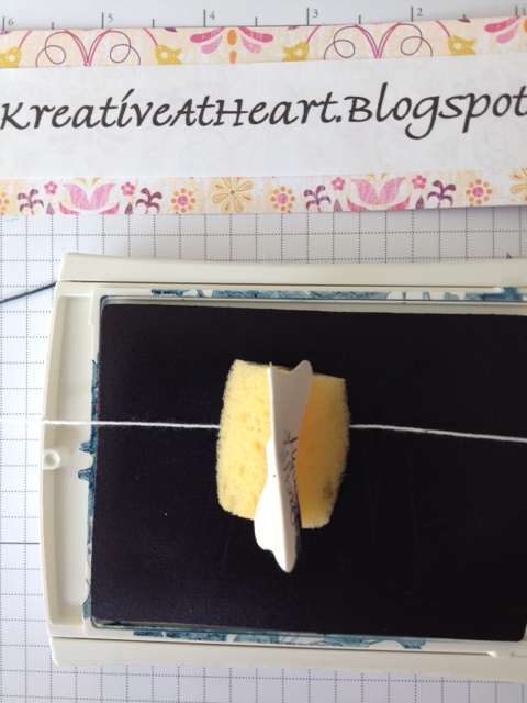
Were almost finished, before attaching the Third layer, I wanted to add some Bakers Twine. Here is another Techn{ink} I learned from my wonderful Upline, Wendy Cranford! Here I cut 28" of my Whisper White Bakers Twine (#124262), 
my Midnight Muse ink (#126860) and a Sponge Dobber (#101610). 
I wanted to color my Whisper White Bakers Twine (#124262) to match my Midnight Muse Cardstock and ink. 
*How you ask?? Simply take your Whisper White Bakers Twine (#124262)and  Dobber (#101610) , softly pressing into the ink pad and Taadaa! 
You now have Customized Twine to coordinate with your project! 
How fabulous is THAT!?! 


Lastly, using the Snail Adhesive (#104332) again, liberally, I adhered my 
Midnight Muse Twine behind the First and Second layer, tying in a knot. 
And finally attaching to the last layer. (See Left)


I found a perfect Stamp to finalize my card and stamped the image in
 Midnight Muse ink onto Whisper White (#100730) 
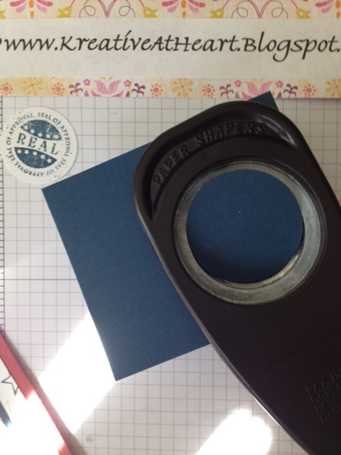
Using my Stampin Up circle punches 
(because all SU! punches coordinate with each and every stamp set - For quick and easy building) 
I punched a 1 3/4" circle (#119850)  in Midnight Muse (#126843), then a 1 3/8" circle (#119860) in Red Riding Hood (#111348) and my final stamped image in 1 1/4" circle (#119861) 
I attached all three layers together with my Snail Adhesive(#104332)
and add a dimensional (#104430) to adhere circle to the card


Here is our completed image!! 
It was SO MUCH FUN!! You will see I even  
added a few colorful brads at the top left corner! 


Here is the inside of the card too.

Cardstock: Whisper White Cardstock #100730, Red Riding Hood #111348, and Midnight Muse #126843.

Ink: Crumb Cake #126975, Midnight Muse #126860, and 
Red Riding Hood #126968.

Tools Used: 1 3/4" circle punch #119850, 1 3/8" circle punch #119860,1 1/4" circle punch #119861, Whisper White Bakers Twine #124262, 
Snail Adhesive #104332 and dimensionals #104430.


Monday, June 25, 2012

Kreative Card Club

Hi All!! I hope your weekend was great! 
 Thank you for your emails over the weekend, I greatly enjoyed each and every one! 

So after reading I thought long and hard over the last few weeks.  
I am so excited to announce the new 
Kreative Card Club! 

 Im so blessed to have you as my loyal, loving customers and wanted to offer 
each and every one of you , whether near or far, 
my very best! 
 For more information, Click Here to learn more about my Kreative Card Club

Happy Stampin!

Friday, June 22, 2012

Friday Fun Tutorial


Hi all! Since I am unable to host a class this Friday, 
I wanted to share part 1 of  a 4 part series tutorial with you.

SO MOST OF YOU PROBABLY HAVE ASKED ONE OF THE FOLLOWING QUESTIONS: 

"What makes one card different from another?" 
"A card is just a bunch of layers glued together, but where do I begin?"
"I like to scrapbook but wish I could learn more techniques to make my page standout"
"I would like to make a handmade card but its too complicated, I'm not crafty!"
"How can I reuse/recycle a card front?"

~Over the next few weeks I will answer these questions and more! So follow along~

Today I'm going to show you a Simple Card Front vs. a more Detailed look
 and introduce Layering: 


In this First photo, you see a two layered card with a simple cardstock selection. 
I played it safe with Whisper White and Bashful Blue. 
And a simple enough stamp to get the idea. I still felt something was missing...
I'm my worst critic, I felt the whites were very stark to the eye and the blue was a bit too soft
and last but honestly, the ink color was just wrong! 


So in this Second step, I wondered how it would look if I changed it up my card by using a creamier cardstock, Very Vanilla, and a softly designed paper in 
Marina Mist. Marina Mist is a soft gray blue in tone. (See Image on Left) 
Now I got really daring and wanted to see what would happen if I add a Second 
designed paper in a similar design but alternating the colors.
(See Image on Right)
Having the two card bases next to each other can give you a clear comparison of how 
a little change can make a BIG difference.


Here is a close up again of the Designer Papers I selected. 
The colors really accent each other well, what do you think?


In this last portion, I really liked the two patterned designer pieces for the card 
I am forming (See Left) and since I have your attention, I wanted to show you even adding 
a small contrasting color (See Right) can add a new layer, fun pop 
and warmth to the overall appearance.  

In slow and easy steps you can definitely see that layering can be simple enough 
and add charm to the piece you are working on. 
I didn't need to add fancy/bulky items or Ruffled Ribbon
to get a over the top appearance. Just play with what pieces I had before me.

Remember, don't forget to enter your email to Follow Along and you are more than 
welcome to add any questions in the comment section that you may have, 
I check my blog Daily and I am here to help!
FOLLOW ALONG for the next portion of this Friday Fun Tutorial
where we will discuss adding ink colors and answer any questions you may have. 
I enjoy your feedback and am always happy to be here to help!
Thank you for Joining Me

Thursday, June 21, 2012

Thursday Thrill


This is Absolutely my most favorite stamp set. My favorite card and surprisingly
My favorite blend of colors!!! 

A photo cant do justice the vibrant colors and stamps this set offers. 
It makes me want to grab my Passport and Fly to Paris!!


Todays Thursday Thrill is the emphasis on ... Smooch Spritz!! 
I took a close up here of the card to see the Brilliant gold spatters of color. 
So simple, so beautiful.
If ever a product to "Must Have" is the Smooch Spritz. Gold is a great staple to have around but the Vanilla Shimmer.... WOW! Christmas is coming and I better be stocked up! :)

Happy Stampin

Designer Series Paper: First Edition Specialty #121878
Cardstock: Crumbcake #120953, Early Espresso #119686 and Cherry Cobbler #119685
Ink: Always Artichoke #126972, So Saffron #126957, Early Espresso #126974, Crumb Cake#126975 and Cherry Cobbler #126966
Stamp: Artistic Etchings (w:118517 c: 120573)
Perfect Punches (w:117022 c:120516)
Embellishments: 1/8" Taffeta Ribbon in Early Espresso #119959
Gold Glow Smooch Spritz #118770


Wednesday, June 20, 2012

Comfort Cafe CAS Wednesday


Todays CAS (Clean and Simple) card was quick and took less than two minutes to gather,
but not only is the highlight to show the new Comfort Cafe Designer Series Paper but how breathtaking the new In Color Dahlias are shown here!!!  (see the close up)


I'm still working very hard to work with my pretty patterned paper, so that you too could fall in love with it and hopefully show me your own CAS featured card!
Its a big beautiful world out there and by golly.... we are going to CAS some DSP ASAP!

Each Wednesday Im going to continue to show you a card using some scraps of Stampin' Up! DSP
you might have lingering around or a card with fun colorations and more DSP to display. So dont forget to fill in your email to follow along with us and you might just be called out on a week to display your
DSP in a sketch challenge. FUN is all in the Details!!


Stampin' Up! has several fun new DSP designs to choose from. They all coordinate with SU! cardstock, ribbon and inks. A package can get you 12 sheets: 2 each of 6 double sided designs. They come 12'' x 12''. Acid/Lignin Free and durable to the core!!
I have used them for adorning cards, scrapbooks, creating fun flowers and treat boxes!
I'm so ecstatic over SU! Paper and I stand entirely behind it!
After years of wasting hundreds and hundreds of dollars on cheap papers or mostly papers that didnt coordinate with a color scheme I was trying to achieve. Well those days are no more!


Designer Series Paper: Comfort Cafe DSP #126898
Cardstock: Crumbcake #120953, Midnight Muse #126843
Ink: Gumball Green #126861
Stamp: Everything Eleanor (w:124162 c: 124164)
Embellishments: In Color Dahlias (#127556)
Tools Used: Essentials Paper Piercing Mat (#126199) and Pack (#126187)