Friday, June 22, 2012

Friday Fun Tutorial


Hi all! Since I am unable to host a class this Friday
I wanted to share part 1 of  a 4 part series tutorial with you.

SO MOST OF YOU PROBABLY HAVE ASKED ONE OF THE FOLLOWING QUESTIONS: 

"What makes one card different from another?" 
"A card is just a bunch of layers glued together, but where do I begin?"
"I like to scrapbook but wish I could learn more techniques to make my page standout"
"I would like to make a handmade card but its too complicated, I'm not crafty!"
"How can I reuse/recycle a card front?"

~Over the next few weeks I will answer these questions and more! So follow along~

Today I'm going to show you a Simple Card Front vs. a more Detailed look
 and introduce Layering: 


In this First photo, you see a two layered card with a simple cardstock selection. 
I played it safe with Whisper White and Bashful Blue
And a simple enough stamp to get the idea. I still felt something was missing...
I'm my worst critic, I felt the whites were very stark to the eye and the blue was a bit too soft
and last but honestly, the ink color was just wrong


So in this Second step, I wondered how it would look if I changed it up my card by using a creamier cardstock, Very Vanilla, and a softly designed paper in 
Marina Mist. Marina Mist is a soft gray blue in tone. (See Image on Left) 
Now I got really daring and wanted to see what would happen if I add a Second 
designed paper in a similar design but alternating the colors.
(See Image on Right)
Having the two card bases next to each other can give you a clear comparison of how 
a little change can make a BIG difference.


Here is a close up again of the Designer Papers I selected. 
The colors really accent each other well, what do you think?


In this last portion, I really liked the two patterned designer pieces for the card 
I am forming (See Left) and since I have your attention, I wanted to show you even adding 
a small contrasting color (See Right) can add a new layer, fun pop 
and warmth to the overall appearance.  

In slow and easy steps you can definitely see that layering can be simple enough 
and add charm to the piece you are working on. 
didn't need to add fancy/bulky items or Ruffled Ribbon
to get a over the top appearance. Just play with what pieces I had before me.

Rememberdon't forget to enter your email to Follow Along and you are more than 
welcome to add any questions in the comment section that you may have, 
I check my blog Daily and I am here to help!
FOLLOW ALONG for the next portion of this Friday Fun Tutorial
where we will discuss adding ink colors and answer any questions you may have. 
I enjoy your feedback and am always happy to be here to help!
Thank you for Joining Me

Thursday, June 21, 2012

Thursday Thrill


This is Absolutely my most favorite stamp set. My favorite card and surprisingly
My favorite blend of colors!!! 

A photo cant do justice the vibrant colors and stamps this set offers. 
It makes me want to grab my Passport and Fly to Paris!!


Todays Thursday Thrill is the emphasis on ... Smooch Spritz!! 
I took a close up here of the card to see the Brilliant gold spatters of color. 
So simple, so beautiful.
If ever a product to "Must Have" is the Smooch Spritz. Gold is a great staple to have around but the Vanilla Shimmer.... WOW! Christmas is coming and I better be stocked up! :)

Happy Stampin

Designer Series Paper: First Edition Specialty #121878
Cardstock: Crumbcake #120953, Early Espresso #119686 and Cherry Cobbler #119685
Ink: Always Artichoke #126972, So Saffron #126957, Early Espresso #126974, Crumb Cake#126975 and Cherry Cobbler #126966
Stamp: Artistic Etchings (w:118517 c: 120573)
Perfect Punches (w:117022 c:120516)
Embellishments: 1/8" Taffeta Ribbon in Early Espresso #119959
Gold Glow Smooch Spritz #118770


Wednesday, June 20, 2012

Comfort Cafe CAS Wednesday


Todays CAS (Clean and Simple) card was quick and took less than two minutes to gather,
but not only is the highlight to show the new Comfort Cafe Designer Series Paper but how breathtaking the new In Color Dahlias are shown here!!!  (see the close up)


I'm still working very hard to work with my pretty patterned paper, so that you too could fall in love with it and hopefully show me your own CAS featured card!
Its a big beautiful world out there and by golly.... we are going to CAS some DSP ASAP!

Each Wednesday Im going to continue to show you a card using some scraps of Stampin' Up! DSP
you might have lingering around or a card with fun colorations and more DSP to display. So dont forget to fill in your email to follow along with us and you might just be called out on a week to display your
DSP in a sketch challenge. FUN is all in the Details!!


Stampin' Up! has several fun new DSP designs to choose from. They all coordinate with SU! cardstock, ribbon and inks. A package can get you 12 sheets: 2 each of 6 double sided designs. They come 12'' x 12''. Acid/Lignin Free and durable to the core!!
I have used them for adorning cards, scrapbooks, creating fun flowers and treat boxes!
I'm so ecstatic over SU! Paper and I stand entirely behind it!
After years of wasting hundreds and hundreds of dollars on cheap papers or mostly papers that didnt coordinate with a color scheme I was trying to achieve. Well those days are no more!


Designer Series Paper: Comfort Cafe DSP #126898
Cardstock: Crumbcake #120953, Midnight Muse #126843
Ink: Gumball Green #126861
Stamp: Everything Eleanor (w:124162 c: 124164)
Embellishments: In Color Dahlias (#127556)
Tools Used: Essentials Paper Piercing Mat (#126199) and Pack (#126187)


Tuesday, June 19, 2012

Techn{ink} Tuesday


I have become a huge fan of the clear mount stamps ever since Stampin' Up! introduced them. I rarely ever purchase wood mount sets anymore. I love the easy storage, the fun ability to add multiple images to one block and of course, the fact that the clear mount stamp sets are less expensive so I can buy more of them!
Todays Techn{ink} Tuesday, I want to show you a fun, unique way to use your clear blocks - Clear Block Shadow Stamping!!! 
Did you know you can stamp direct to paper with Stampin' Up! Clear blocks? So Awesome!
Try using different sizes and shapes of blocks on all of your stamping cards and projects. I enjoy this Techn{ink} to give a card a more distressed or aged appearance. 
Here are step by step instructions:


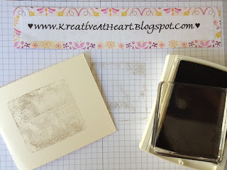
First you will need a clean piece of Cardstock, Classic Ink and a Clean, Clear  Block.
My Clear Block size is 'D', Cardstock is Very Vanilla and Ink is Crumb Cake

Ink up your clear block onto the Crumb Cake and to avoid a heavy stamp of color, I inked off to the side (see middle image) of the paper to lessen the punch of color, 
then stamped onto my cardstock for a soft image.


Then I took the same clean block and lightly tapped the four edges onto the Early Espresso Ink Pad
and stamped over the initial image. Now my distressed stamp has a subtle frame of a shadowed color to enhance the look. 
Decorate your card as you see fit. 

CLICK HERE to see the Clear Mount Block Template to reference the different block sizes SU! has to offer. I recommend printing this page onto vellum or copy paper so that you can place over an image to see what size block is needed. You can find SU! new Clear Block Bundles offered HERE


Cardstock: Very Vanilla #101650
Ink: Crumb Cake #126975, Early Espresso #126974
Tools Used: Clear Block Bundle C,D,H (#129851)


Monday, June 18, 2012

Monday Mailers

I had this card with a special new friend in mind. Her name is Jackie and she will be
 celebrating her 85th birthday this month. What a beautiful life! 
Imagine the stories she could tell. I desire to hear each and every one. 
She is a wonderful woman and I cant wait to send her this little birthday card as a token of my friendship. 


First I cut down a piece of River Rock cardstock to a 5x5 and scallop edged each end. 
Then cut down a pieces of Not Quite Navy
 to 4" x 8" and fold in half. 
Adhere the folded card on to the flat scallop edged River Rock.  


I wanted to add a little texture to the card, so I cut a piece of Summer Starfruit (#126839) 
to 3 1/2" x 3 1/2" and scored with my new fun toy! 
I must say I absolutely adore my Simply Scored Plate. The possibilities are endless. 
I could spend weeks and weeks just showing you projects using this wonderful tool alone! 
But... Focus Nikki ... Focus

Last, I cut my Very Vanilla to an exact 3'' x 3" and wrapped it with some fun 
Early Espresso Bakers Twine 


And here is the final product once all pieces are added together. You will see I have added a 1 1/4" x 4" pieces of DSP and adorned the front of my Bakers Twine with our Natural Buttons and a 
Birthday Sentiment from the Petite Pairs Set
stamped in Not Quite Navy Ink 

Im so excited for her to recieve her card. I hope on her birthday she is surrounded by her loved ones and is reminded of how much her life is treasured by each person who is blessed to know her.  
Happy Birthday My Dear Friend Jackie! 


Designer Series Paper: Comfort Cafe DSP #126898
Cardstock: River Rock #108640, Very Vanilla #101650, 
Not Quite Navy #101722Summer Starfruit #126839
Ink: Not Quite Navy #126971
Stamp: Petite Pairs (w:122495 c: 122497)
Embellishments: Naturals Designer Buttons #127554 and Early Espresso Bakers Twine #123124
Tools Used: Simply Scored Plate #125625